What is Etera?
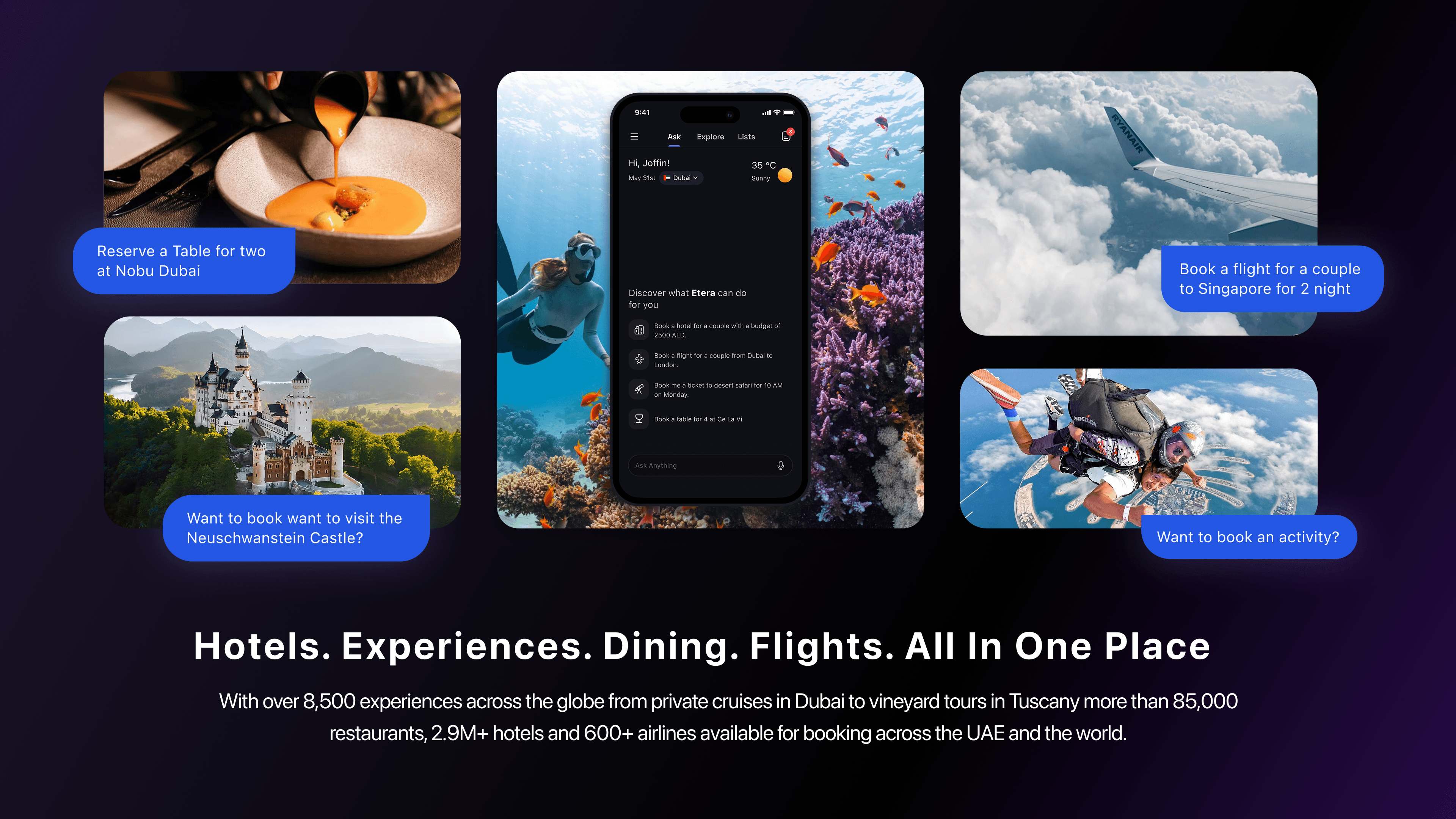
Etera is an AI-powered travel super app that brings Hotels, Experiences, Dining and Flights into a single, conversational interface. The product combines 8,500+ curated experiences and 85,000+ restaurant listings with an AI concierge layer that lets users book anything through natural language no filters, no friction.
Travel planning today is broken. Users juggle four to five different apps to plan a single trip one for flights, another for hotels, a third for restaurants, a separate one for activities. Each platform has its own search logic, its own account, its own checkout. The result is a fragmented, exhausting experience that turns what should be exciting into something that feels like admin.
Etera was built to fix that. The ambition was to make travel planning feel like talking to a knowledgeable local friend who can also take action on your behalf one conversation, one app, everything handled.
Our Team
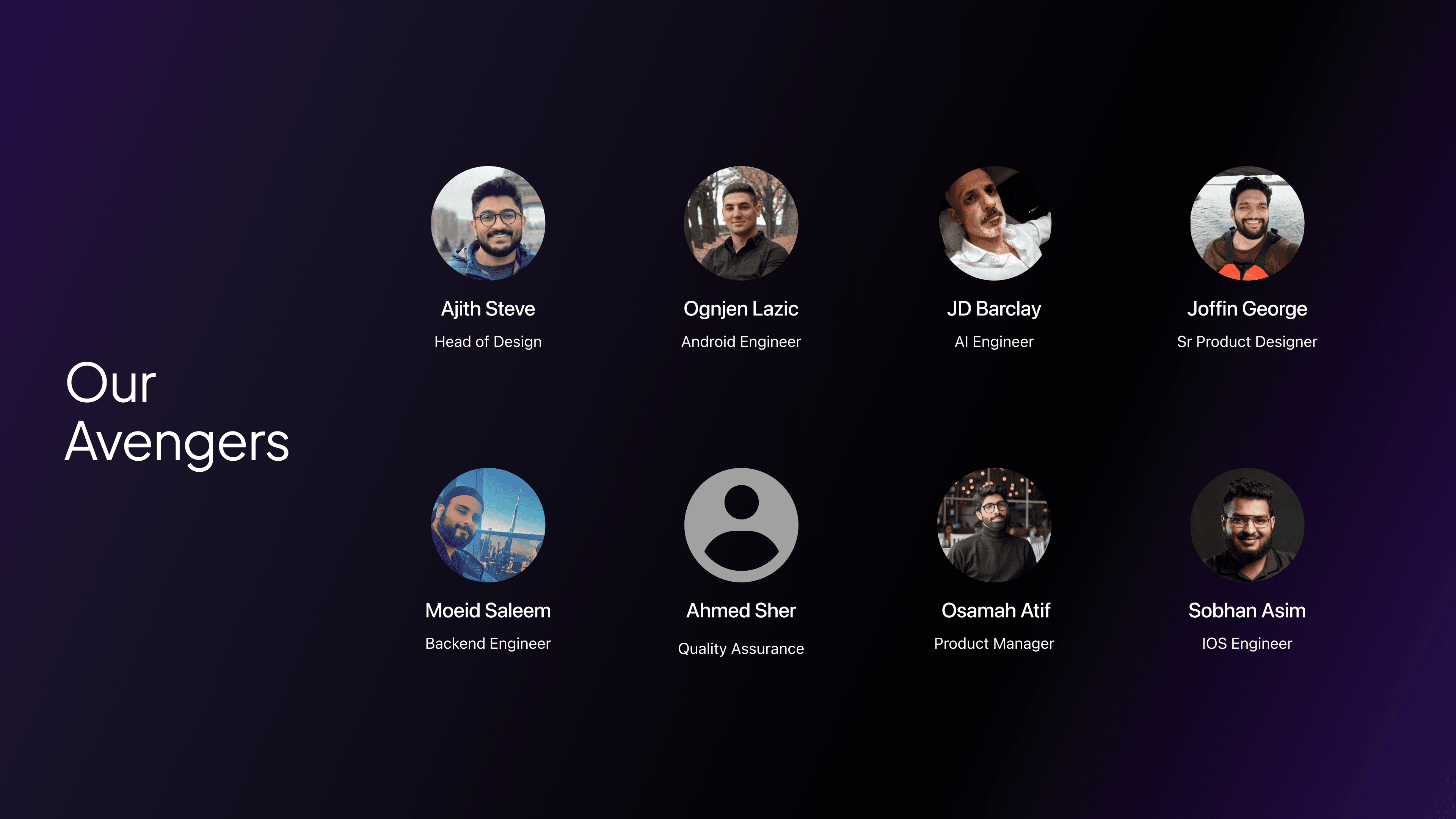
Etera was a 10–15 person team CTO, engineers across backend, mobile, AI and DevOps, QA, and influencer marketing all building toward the same product. The few pictured here are people I worked with most closely day-to-day aligning on feasibility, catching issues early in QA and making sure design decisions held up through to build.
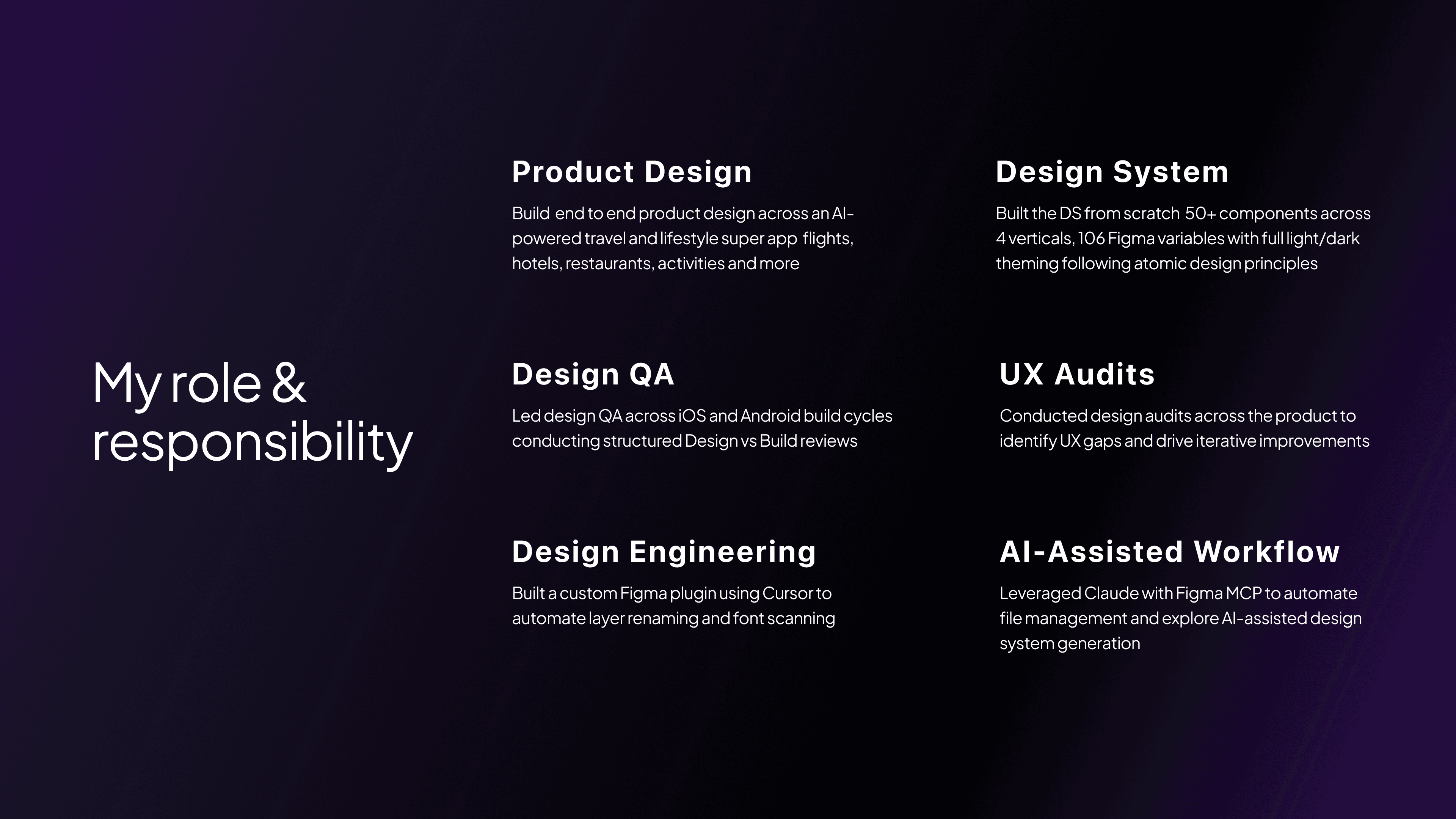
My Role
The Challenge
Building Etera meant solving three interlocking problems simultaneously with no prior design system, no established AI interaction patterns to follow and a product scope that spanned five distinct verticals from day one.
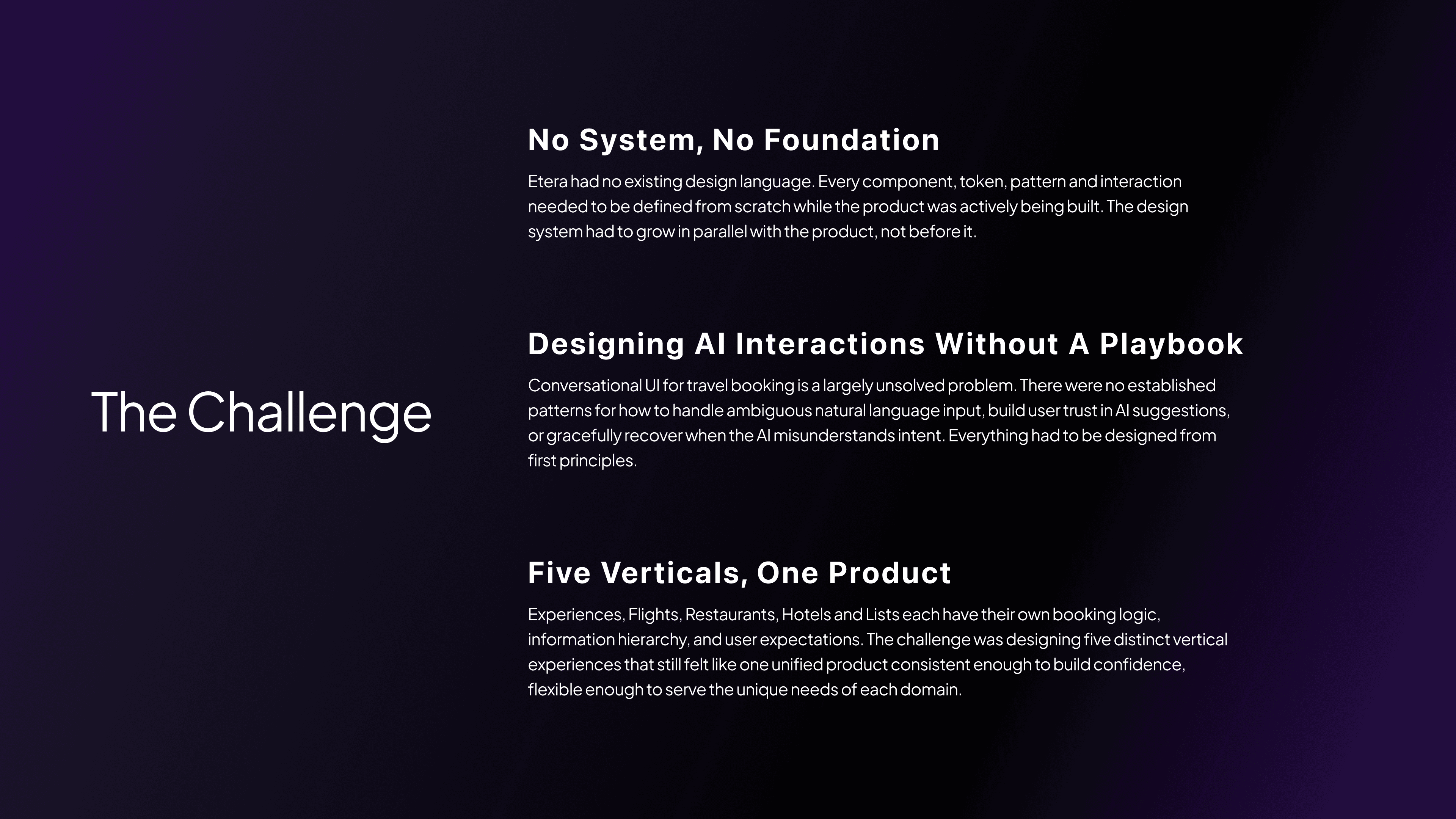
Design System
Before designing any screens, I established the foundation. The Etera design system was built from the ground up using atomic design principles starting with primitives and scaling up to complex, reusable patterns.
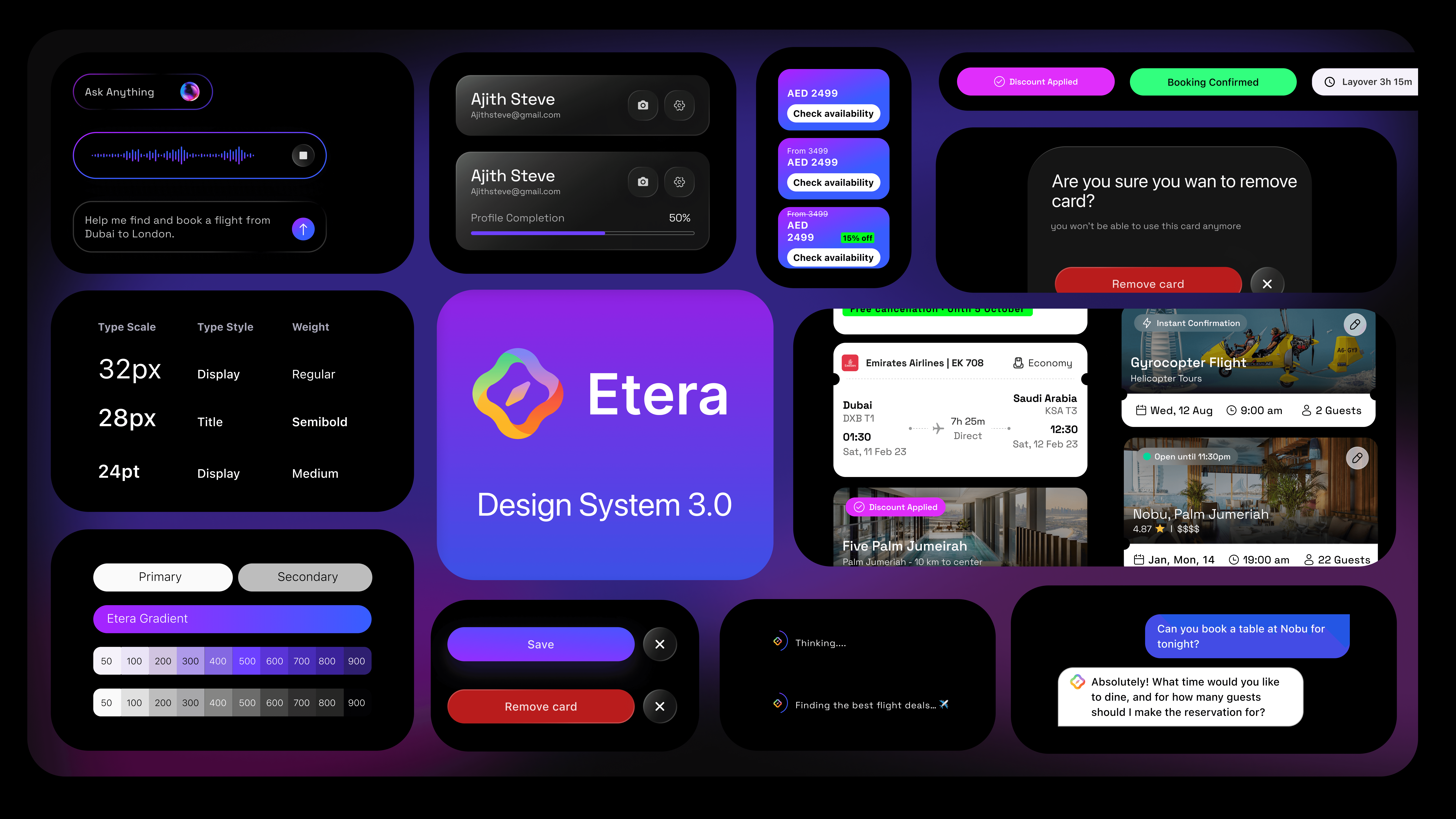
Tokens first. I defined 106 Figma variables covering colour, typography, spacing, radius, and elevation all structured to support both light and dark theming from day one. Token naming followed a semantic model, so values carried meaning rather than just appearance.
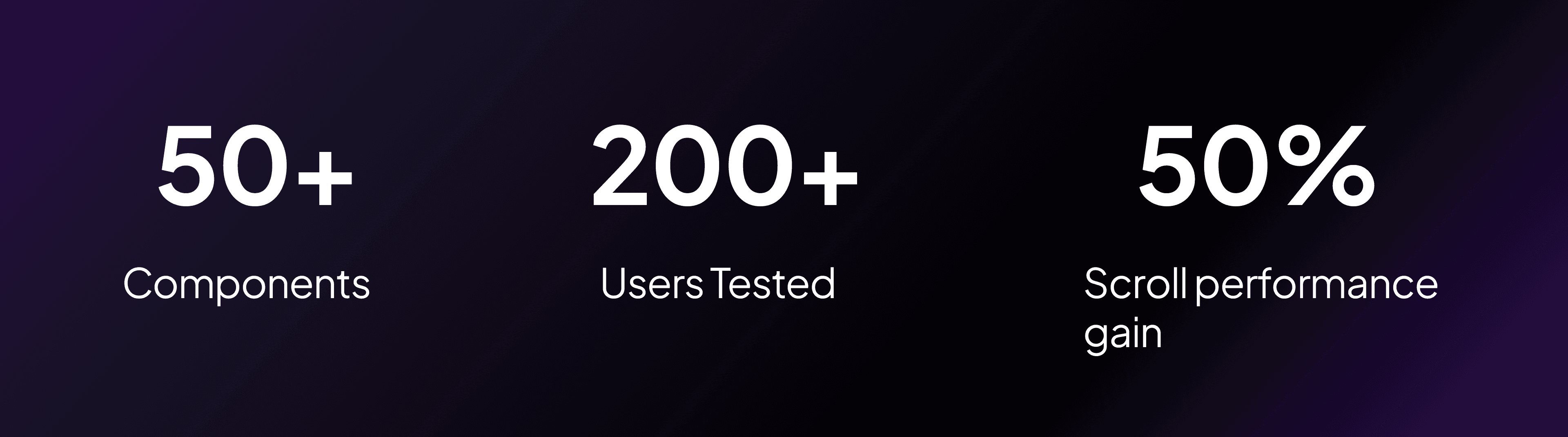
50+ components. Atoms became molecules, molecules became organisms. Each component was built for composability designed to work in isolation and in combination across all five verticals. Every component shipped with documented states (default, hover, active, disabled, error) and was spec'd for developer handoff.
Cross-vertical consistency. The system had to flex. A search bar in Flights needed to behave differently from one in Restaurants but both needed to feel unmistakably Etera. I used the token and component architecture to allow contextual variation without visual fragmentation.
Five Verticals
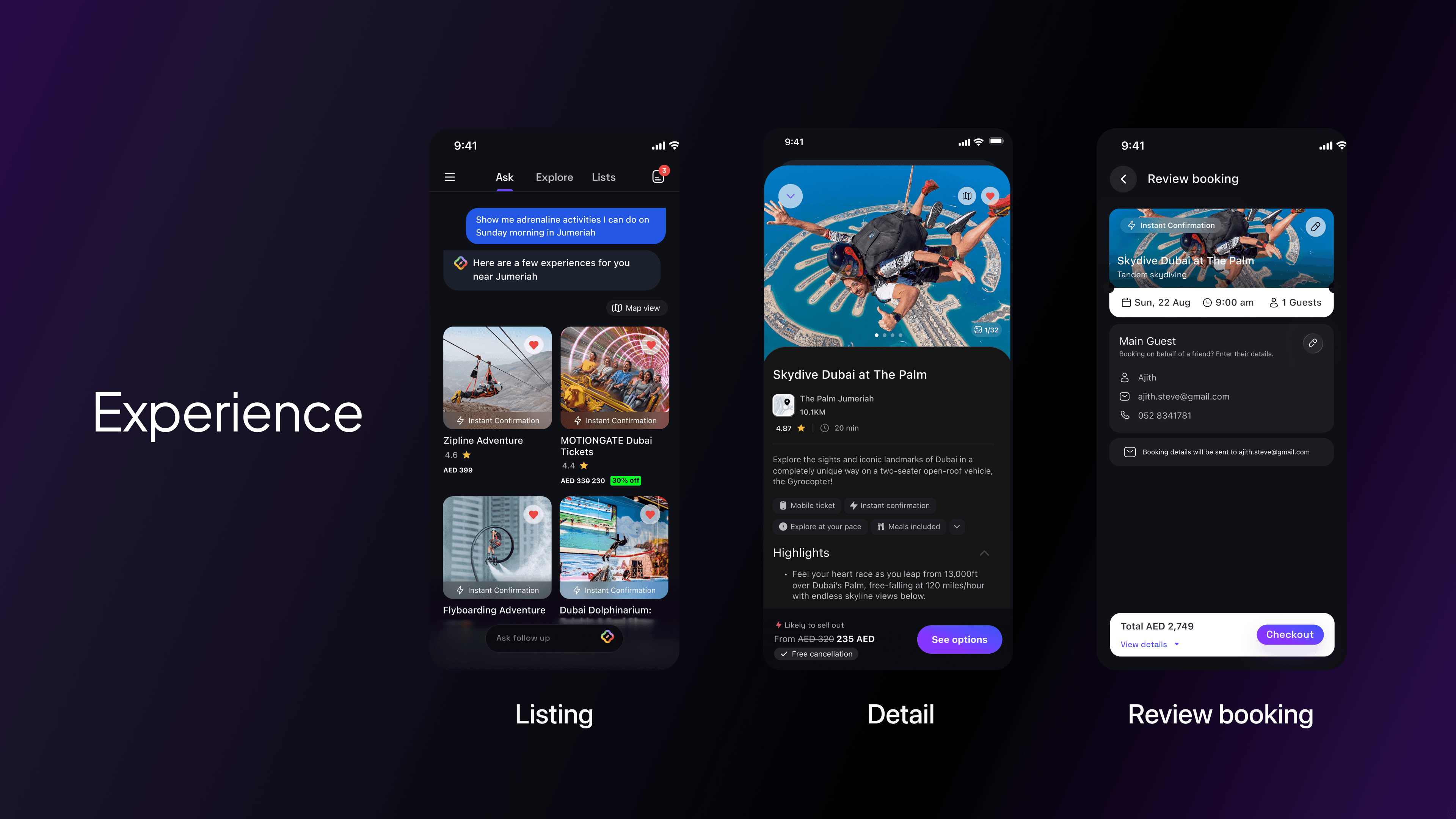
Experiences (Activities & Entertainment) Designing for discovery at scale 8,500+ experiences needed a browsing and filtering architecture that surfaced the right options without overwhelming the user. The challenge was making discovery feel intentional.
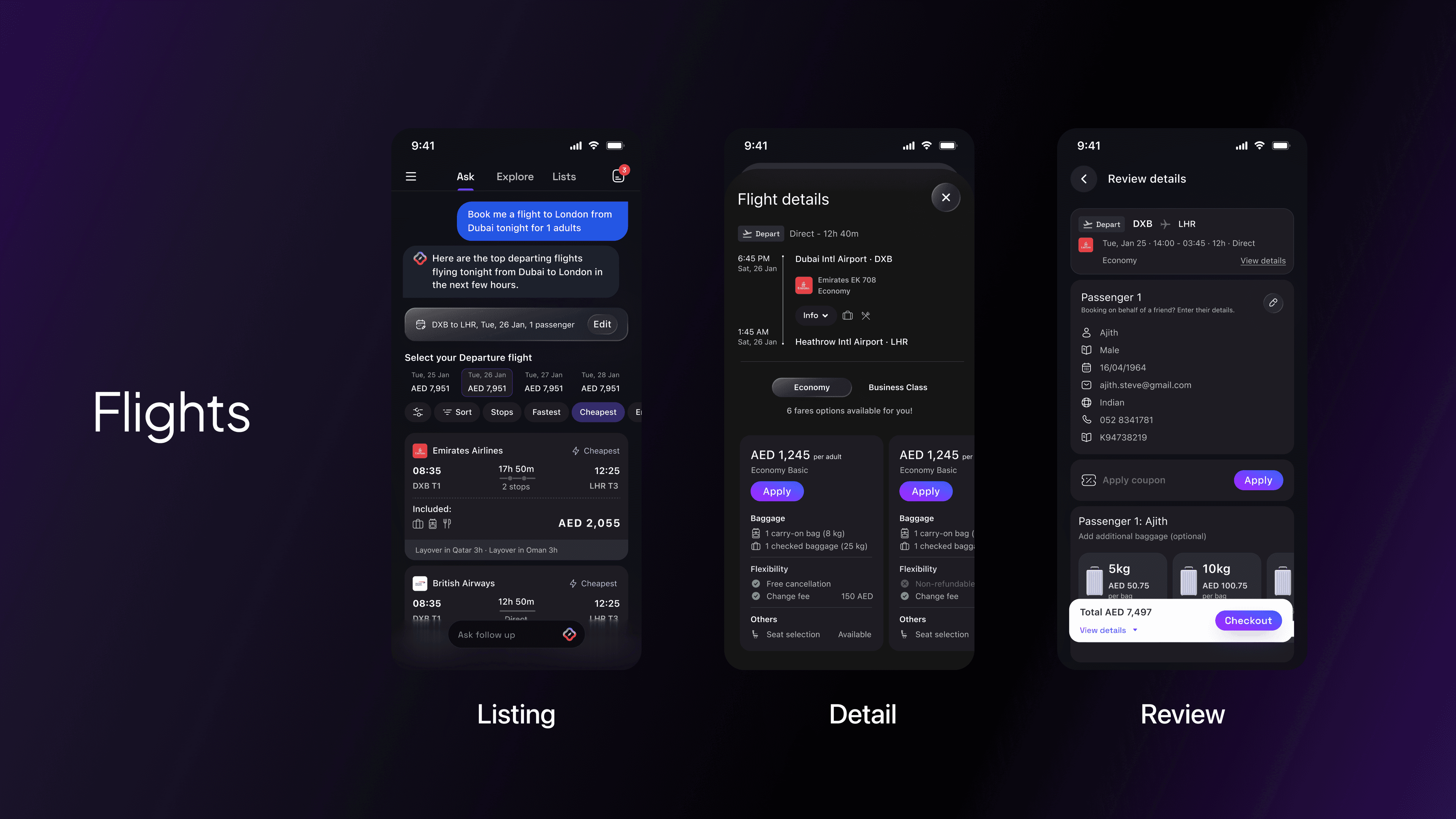
Flights Flights introduced the highest information density of any vertical route options, layovers, price variations, fare classes, and seat selection all in a mobile context. The design challenge was progressive disclosure: showing enough to decide, hiding enough to stay calm.
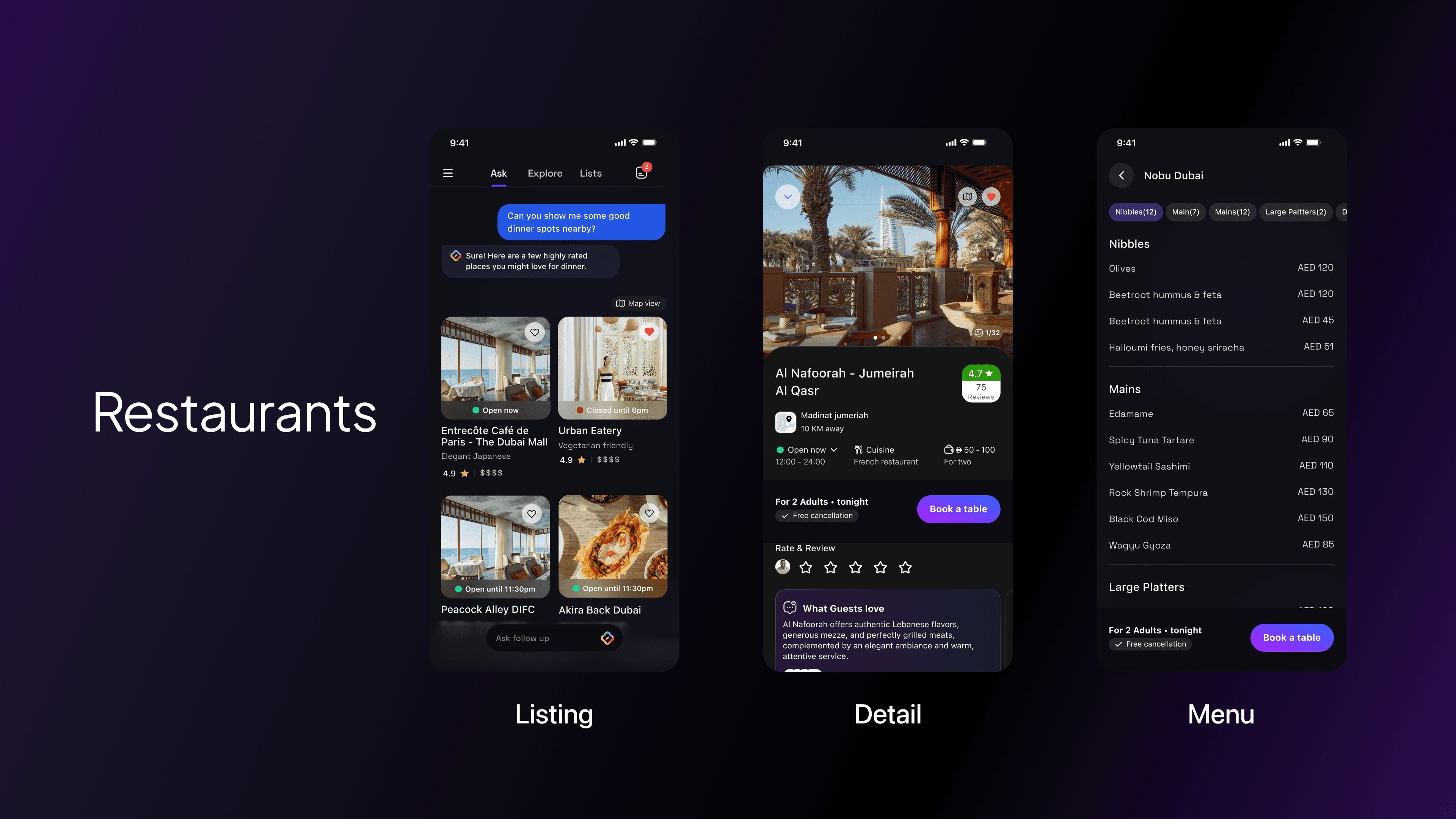
Restaurants With 85,000+ listings, Restaurants was primarily a curation and trust problem. The design focused on signals that build confidence photos, reviews, cuisine tags, and availability combined with a booking flow that required minimal friction to complete.
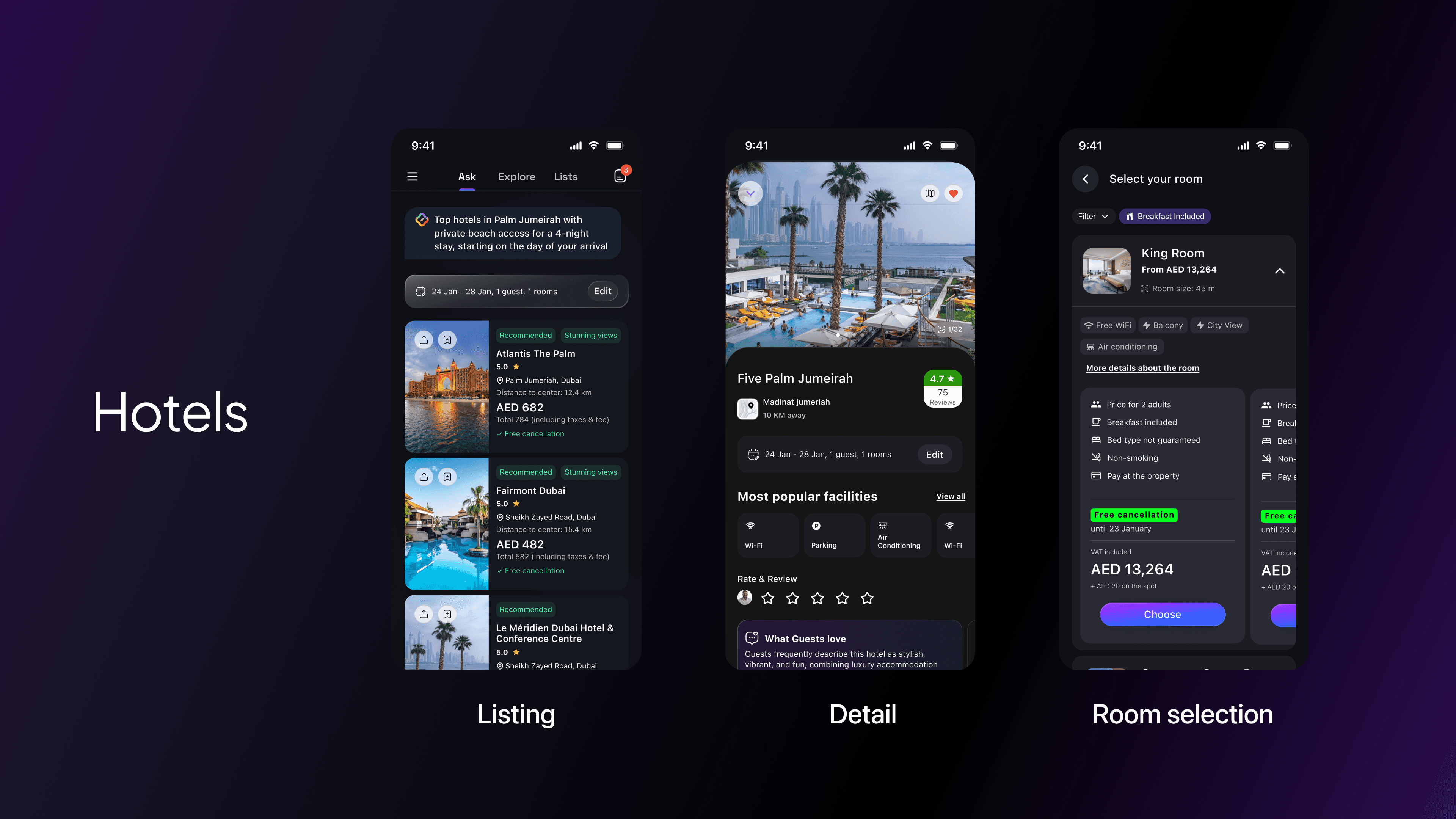
Hotels Hotels sits at the intersection of aspiration and logistics. The vertical needed to balance rich imagery and editorial feel (to inspire) with clear, structured comparison (to decide). I designed a system that shifted registers depending on where the user was in their journey.
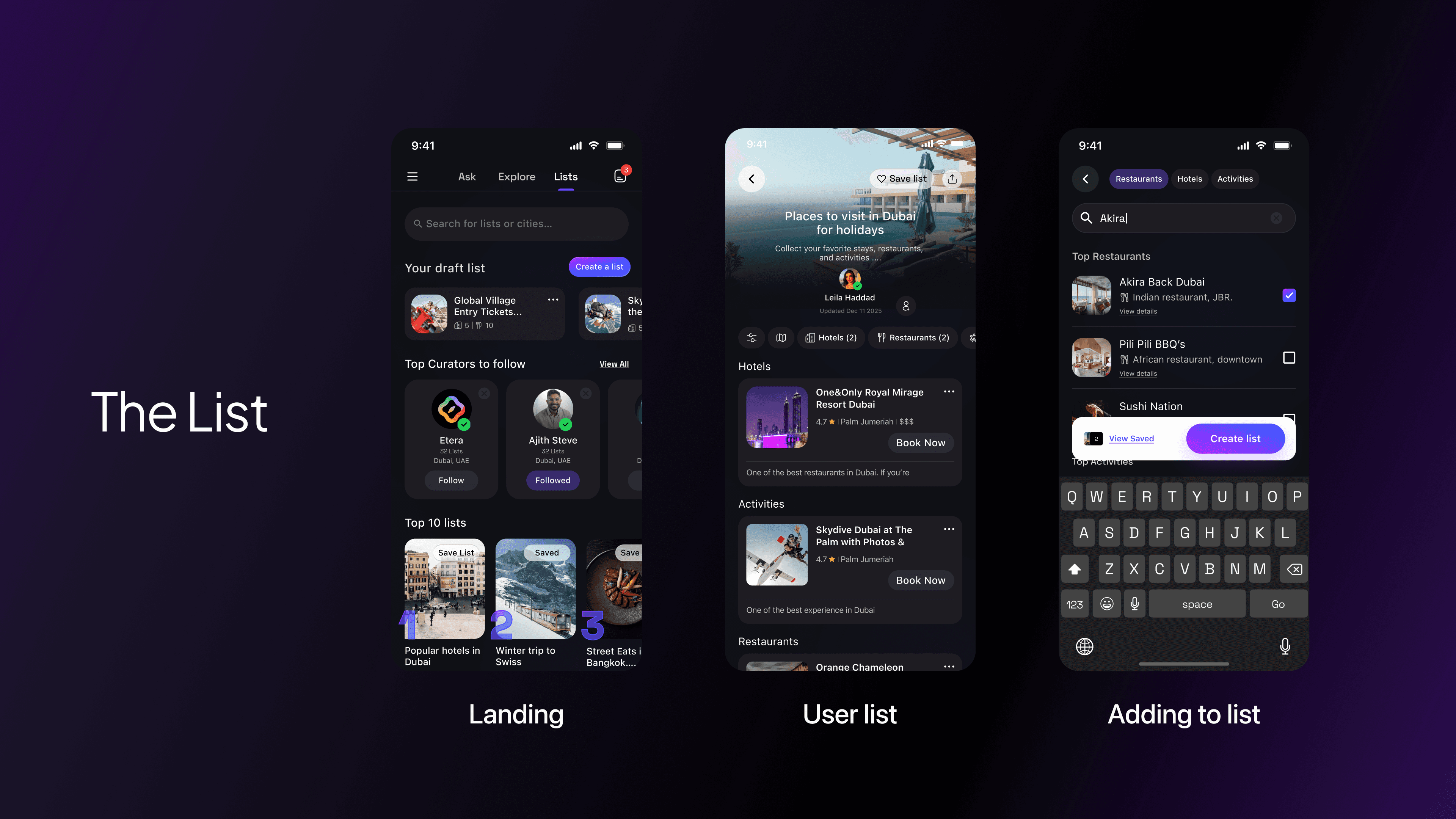
Lists A space for users to save, organise and revisit places across all verticals. The design challenge was creating a pattern that felt native to each vertical type while remaining structurally consistent as a collection tool.
Design Engineering
Custom Figma Plugin As the team scaled and the file complexity grew, manual layer management became a bottleneck. Layer names were inconsistent, font usage was hard to audit and handoff prep was eating design time. I built a custom Figma plugin using Cursor that automated two of the most repetitive tasks: layer renaming (enforcing a consistent naming convention across components) and font auditing (scanning the file for non-system fonts and flagging deviations from the token library). The plugin eliminated a manual process that had been costing the team hours.
Claude + Figma MCP I integrated Claude with the Figma MCP to explore AI assisted design system operations automating file management tasks, running component audits and testing prompts for design system generation. This wasn't just about personal efficiency; it was an experiment in what AI assisted design workflows could look like at a product team level.
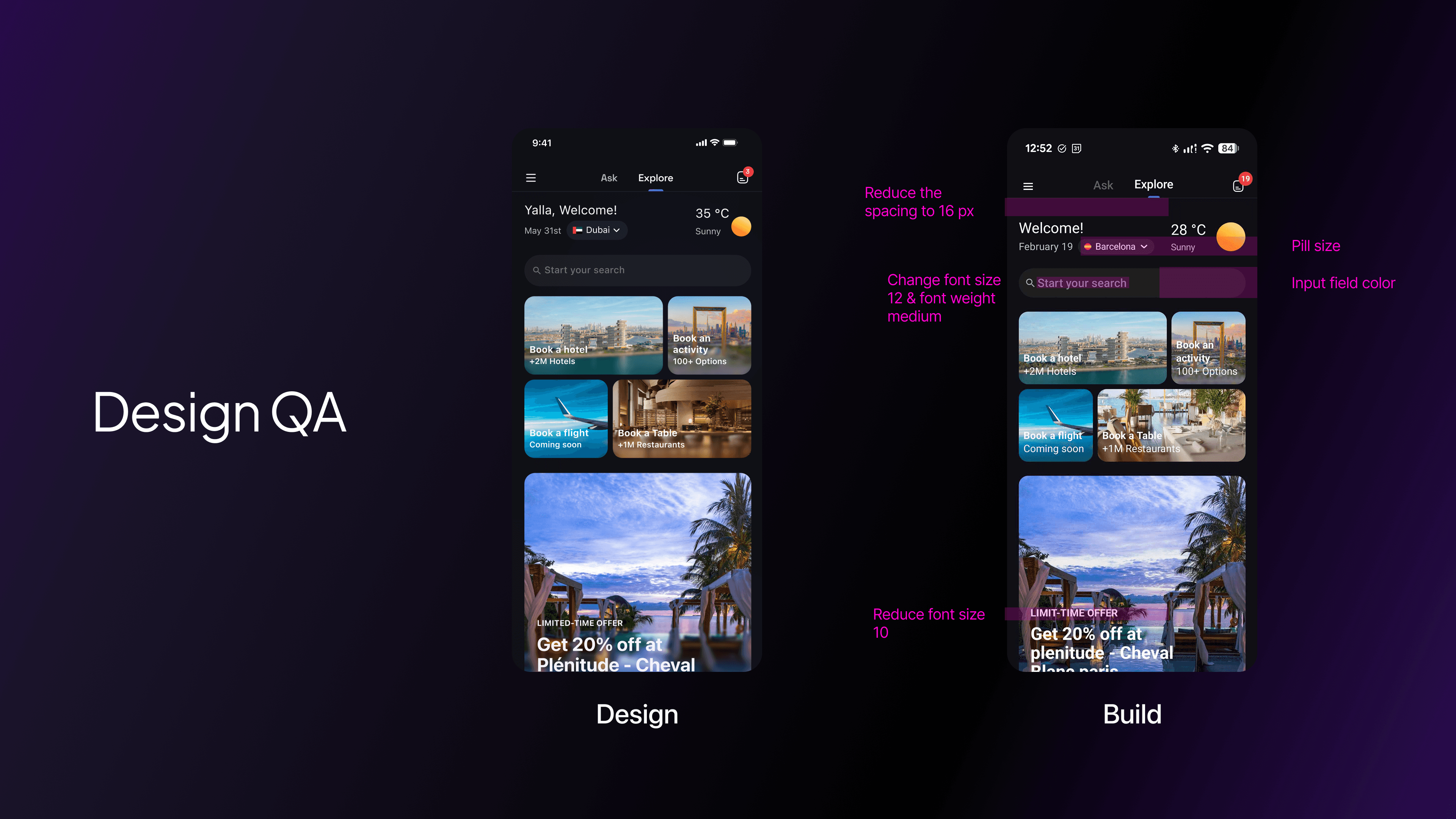
Design QA
Good design doesn't survive a bad build review process. At Etera, we established a structured Design vs Build review methodology that ran on a regular cadence across both iOS and Android build cycles.
Each review compared the live build against the Figma spec across four dimensions: visual fidelity (spacing, colour, type), interaction behaviour (transitions, states, gestures), edge cases (empty states, error states, long content) and component consistency (correct component usage, no one-off implementations).
Issues were logged and reproduced in shared documentation accessible to the full engineering team. The goal wasn't to police it was to close the feedback loop fast enough that implementation drift didn't compound across sprints.
Post Friends & Family Release
With the first version of the restaurant & Experiences vertical live for friends and family, we ran a structured testing programme 200+ real users going through the full experience end to end.
The process had three stages:
Collect feedback. Structured sessions with 200+ friends and family across the complete restaurant booking flow from AI-powered discovery through to the post-booking state. We captured where users paused, what they re-read, and where they dropped off entirely.
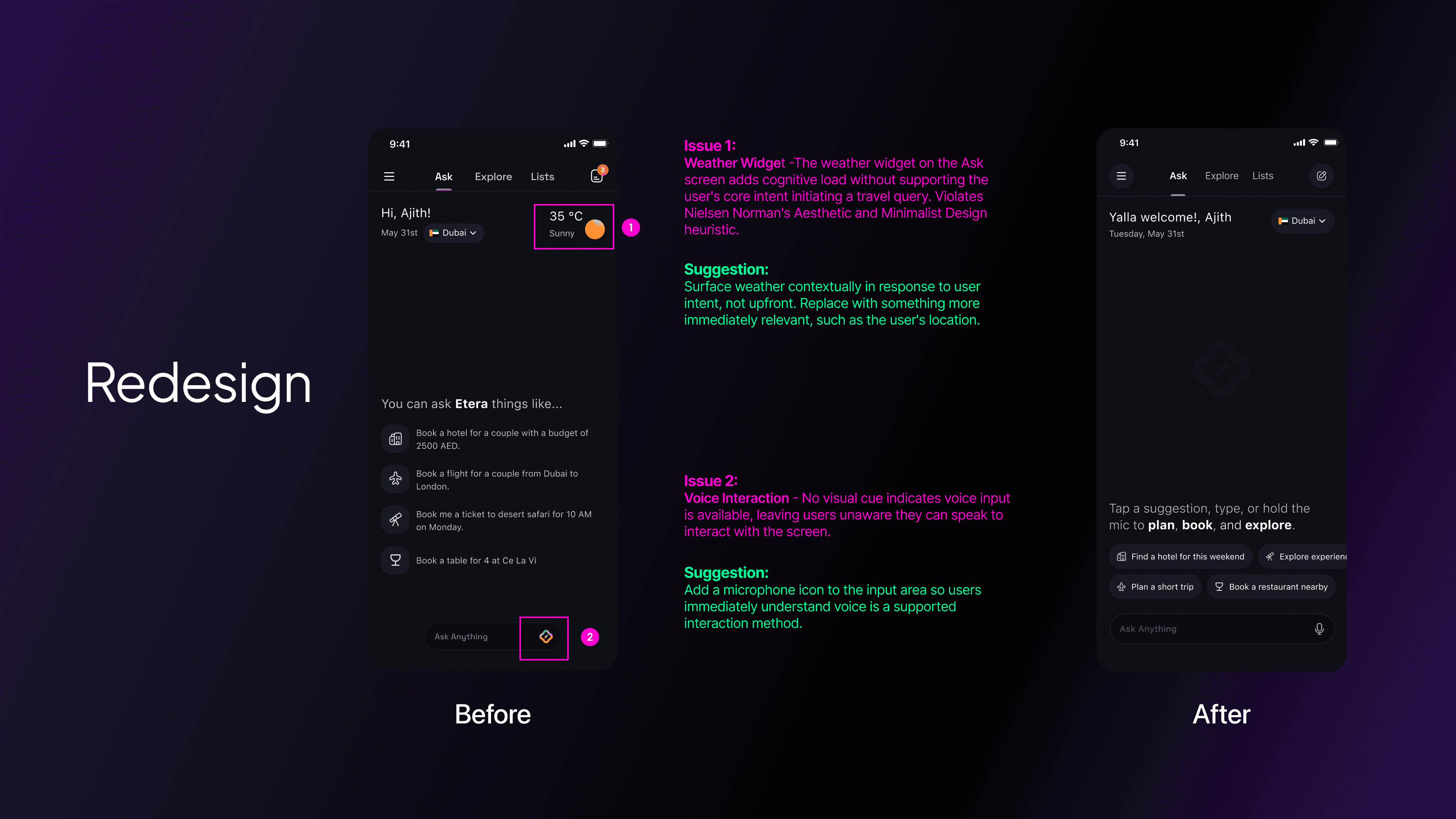
Identify patterns. Raw feedback was clustered into recurring friction themes and usability breakpoints, grouped by stage in the flow rather than by individual screen. This revealed four distinct problem areas.
Compile the audit. Each issue was documented with the screen it occurred on, the heuristic it violated, and a specific improvement suggestion. The output was a structured audit document not a list of opinions.
UX Audit, Benchmark & Redesign
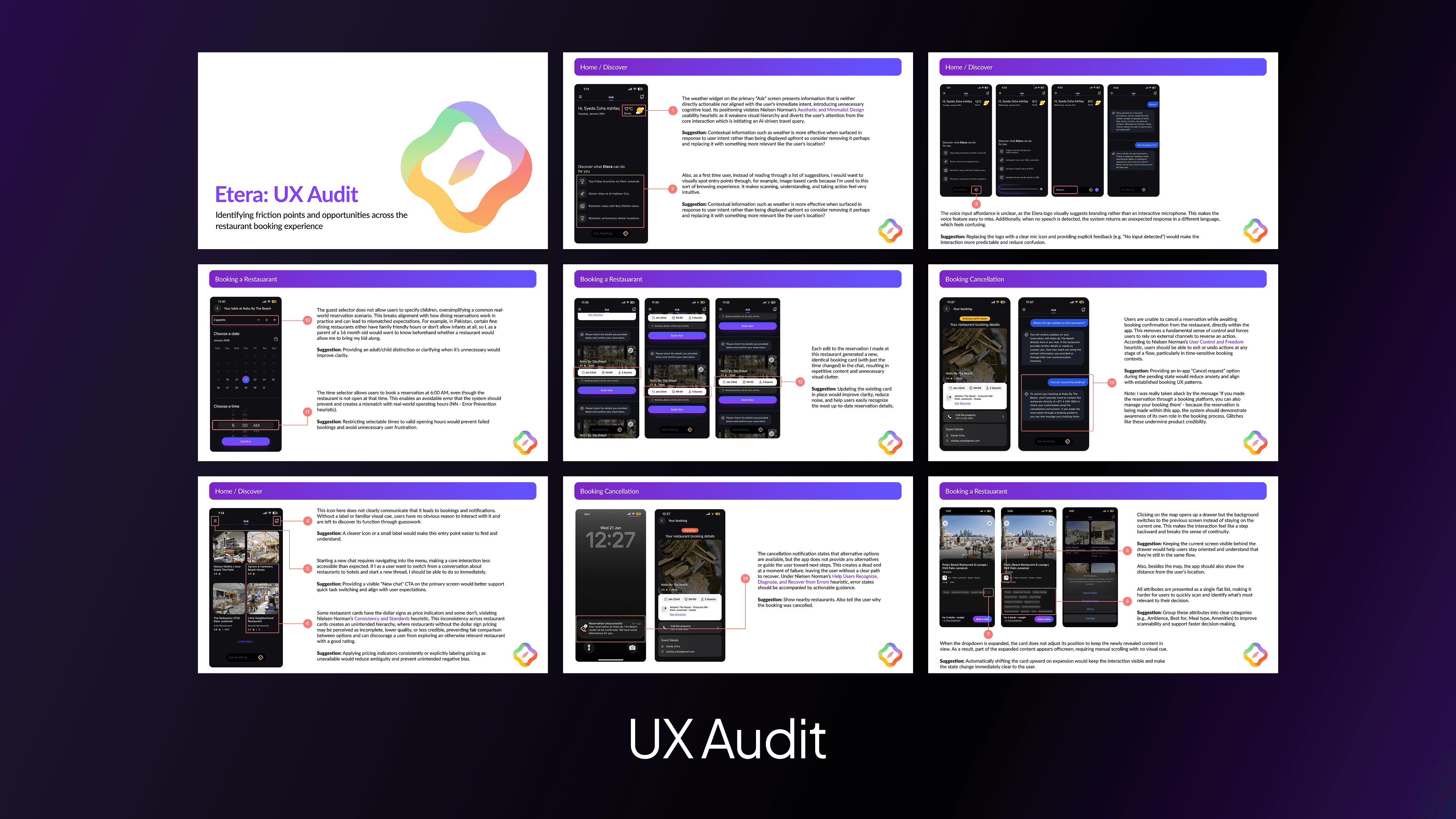
UX Audit 14 friction points documented across the live restaurant experience each annotated with the heuristic violated and a specific improvement suggestion.
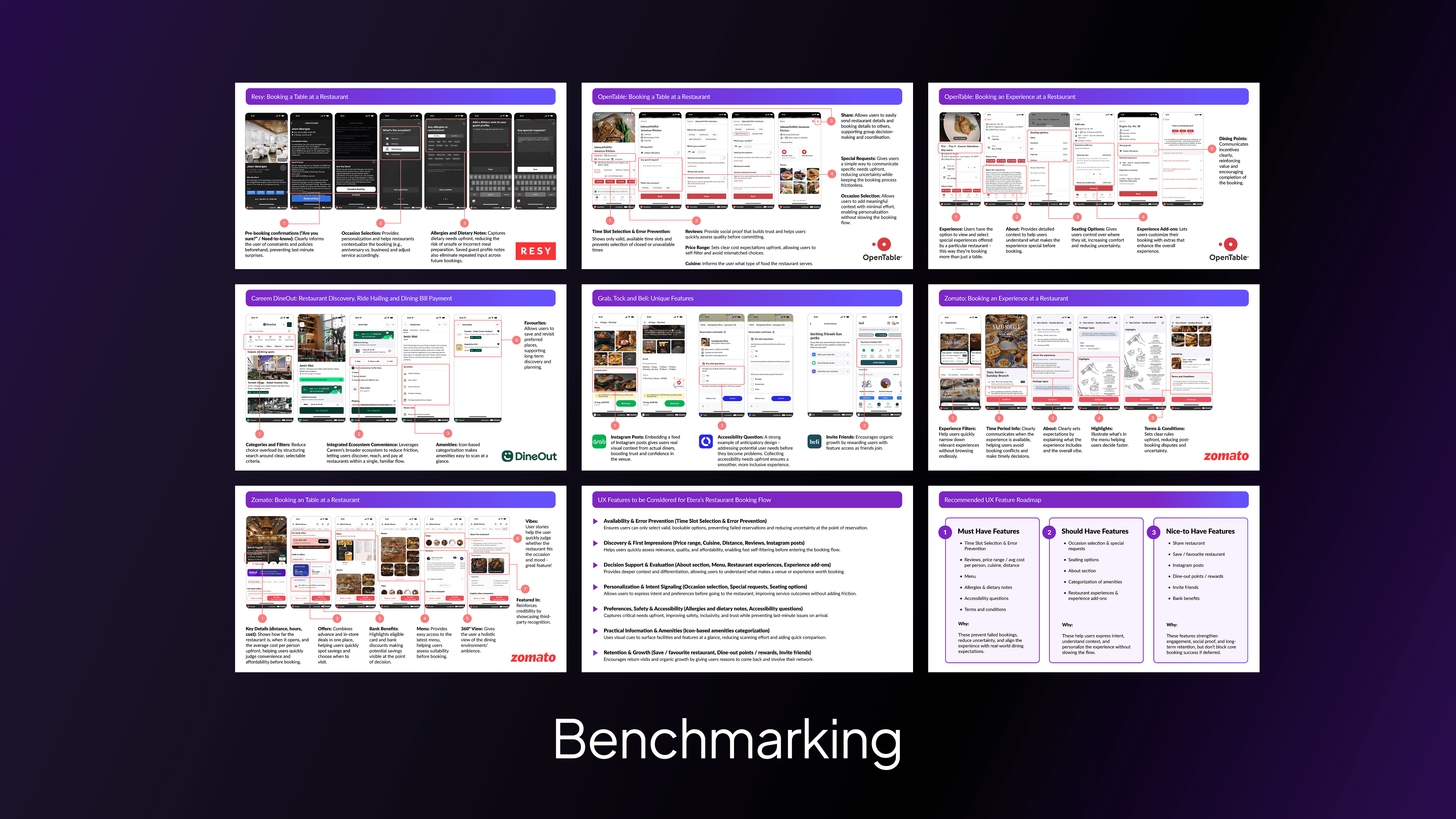
Benchmark Analysed category leaders across discovery, booking flow, and post-booking states to identify patterns worth adopting and validate redesign priorities.
After the restaurant vertical live for friends and family, we ran a structured testing programme with 200+ users to identify friction across the full booking flow. The audit surfaced issues were grouped into four themes — Discovery Friction, Detail Page Confusion, Booking Flow Errors, and Post-Booking Gaps.
Before redesigning, I benchmarked against the category leaders OpenTable, Zomato, Resy and Dineout to validate priorities and identify patterns worth adopting across discovery, booking flow, and post-booking states.
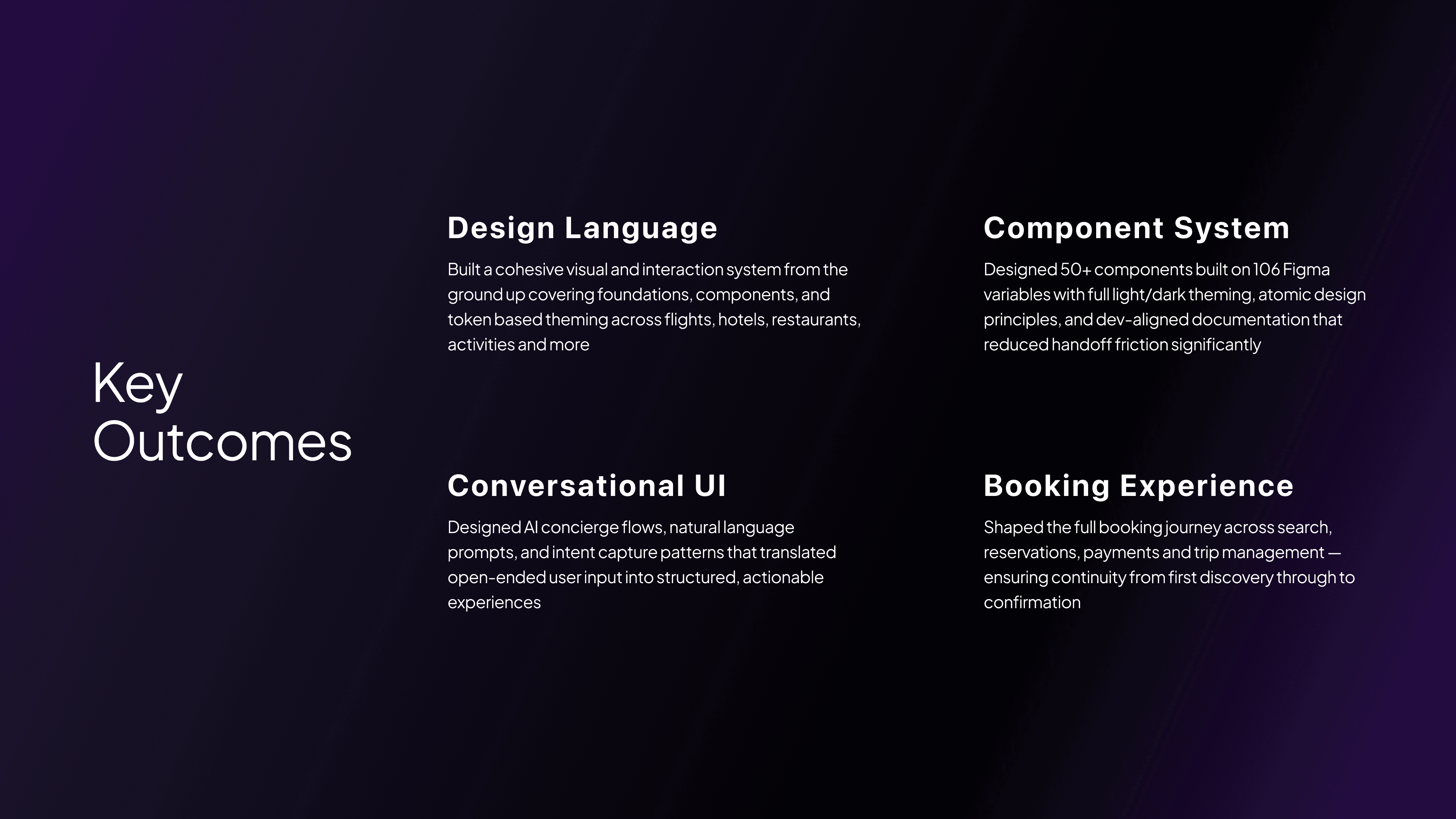
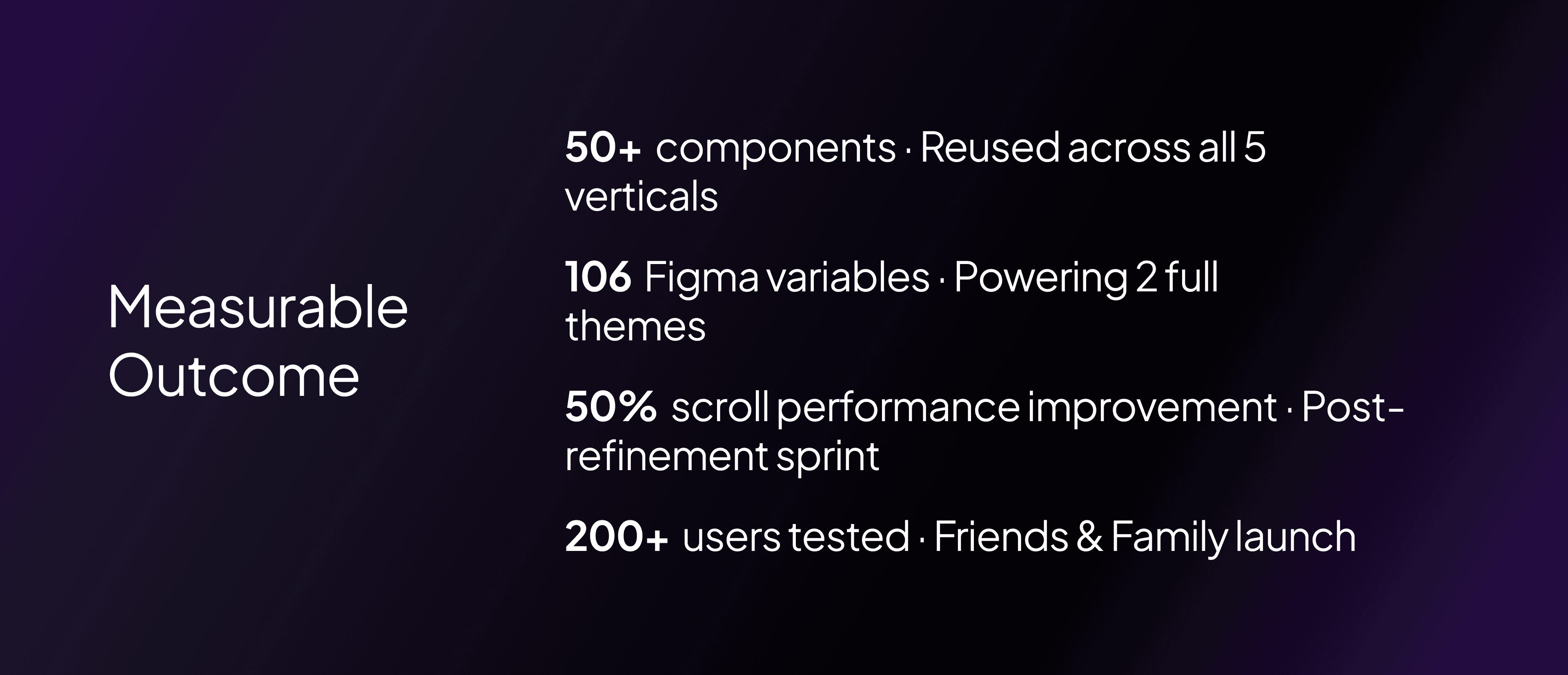
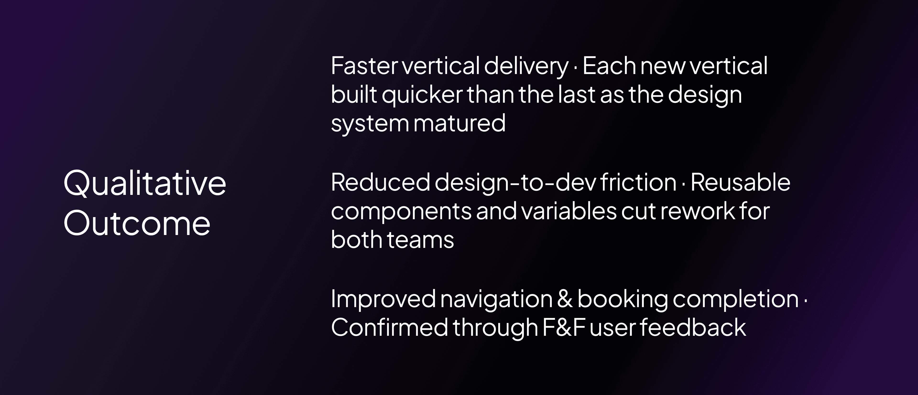
Key Outcomes
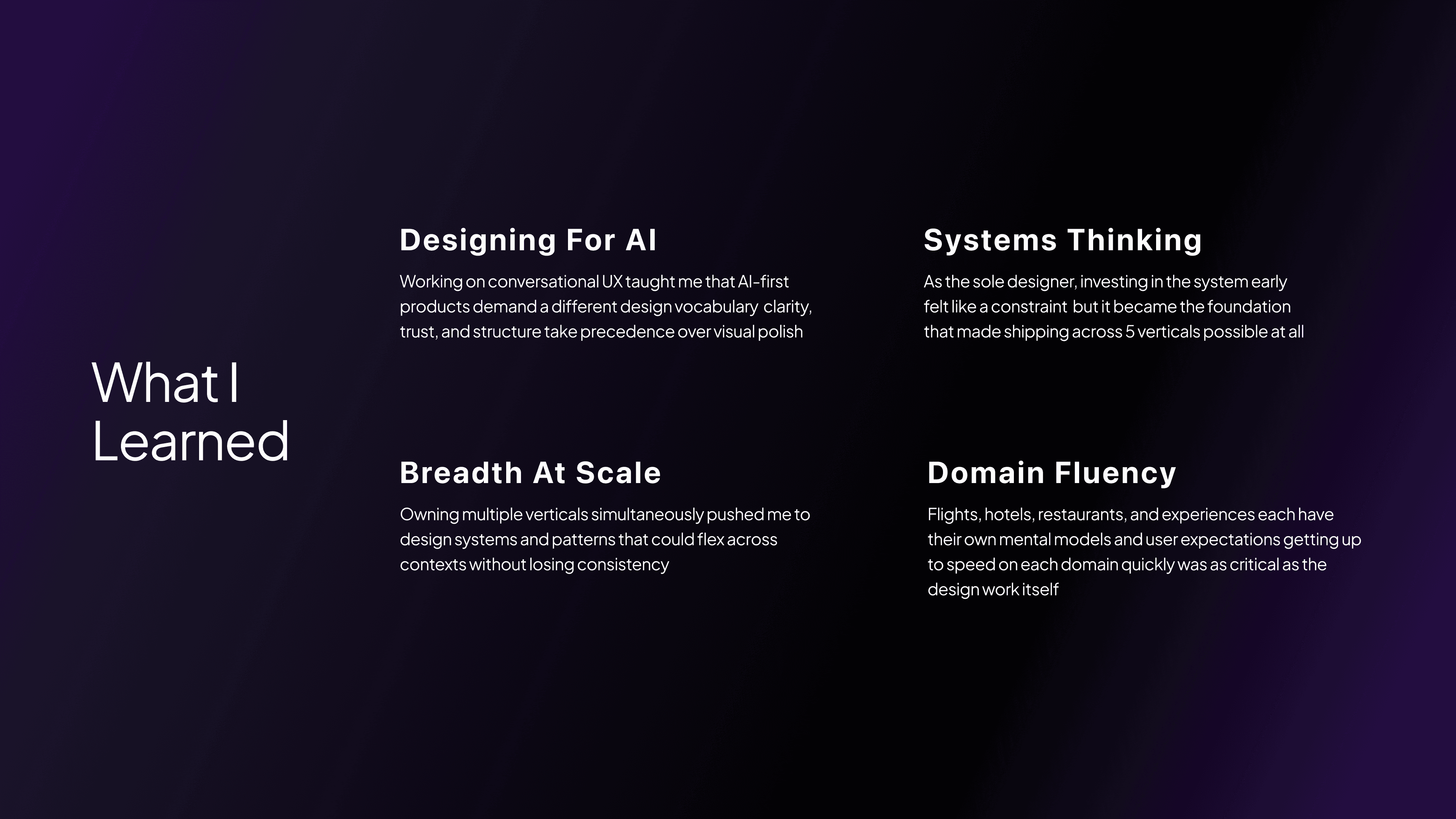
What I learned