
Objective
To enhance the usability and discoverability of key features on the dashboard of a financial services app used by blue collar workers in the UAE, ensuring the experience is aligned with the lifestyle, digital habits, and financial behaviors of the user persona.
Problem
The current dashboard experience presents multiple issues:
Excessive scrolling required to find or use key features
Low discoverability of many products and services
High cognitive load due to the visual layout and clustering of features
Many important actions are overlooked, reducing user engagement and task completion
User Persona
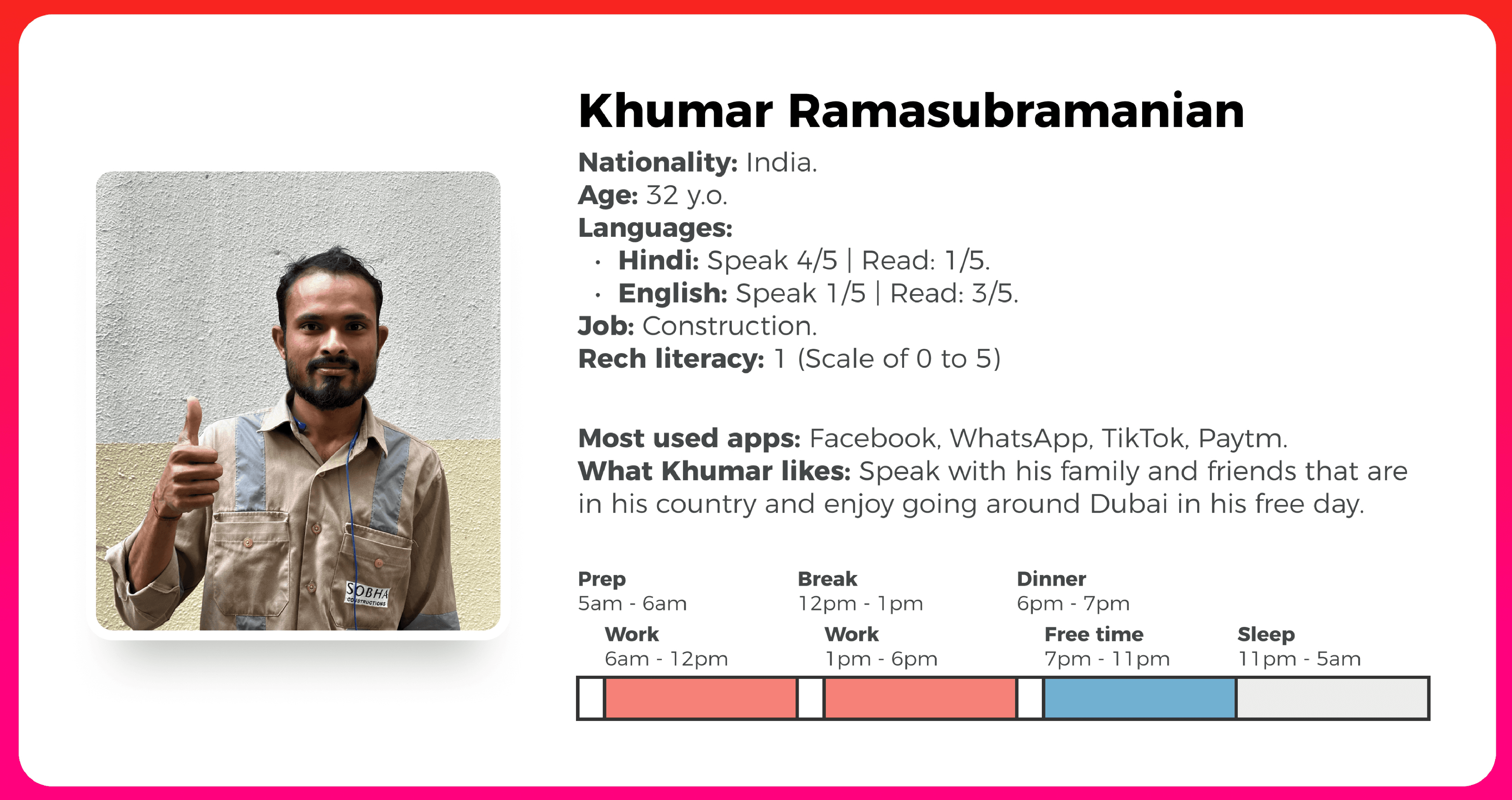
Framing the Problem: Insight-Driven Problem Solving
To deeply understand what changes were necessary, I began by framing a set of How Might We (HMW) questions. These helped guide brainstorming and design decisions.
HMW Statements & Insights
1. HMW strategically determine what features to present without compromising key actions?
Insight: By identifying the most frequently used features (e.g: balance inquiry and last transactions) we could prioritize them on the dashboard and move less-used features (e.g., ATM PIN, SMS service) into a menu.
2. HMW strategically determine what information to present to the user?
Insight: Understanding what information is most relevant to users (e.g., current balance, last few transactions) allowed us to limit dashboard data to only what adds value.
3. HMW refine the dashboard experience to amplify its usefulness?
Insight: A layout prioritizing high-frequency features and actions helps users complete tasks faster and with less confusion, reducing drop-off.
4. HMW increase discoverability and reduce cognitive load?
Insight: Removing or relocating lesser-used services (like loans, bill payments) and using clean visual hierarchy improves usability and reduces overwhelm.
These insights helped decide what to keep on the dashboard versus what to deprioritize.
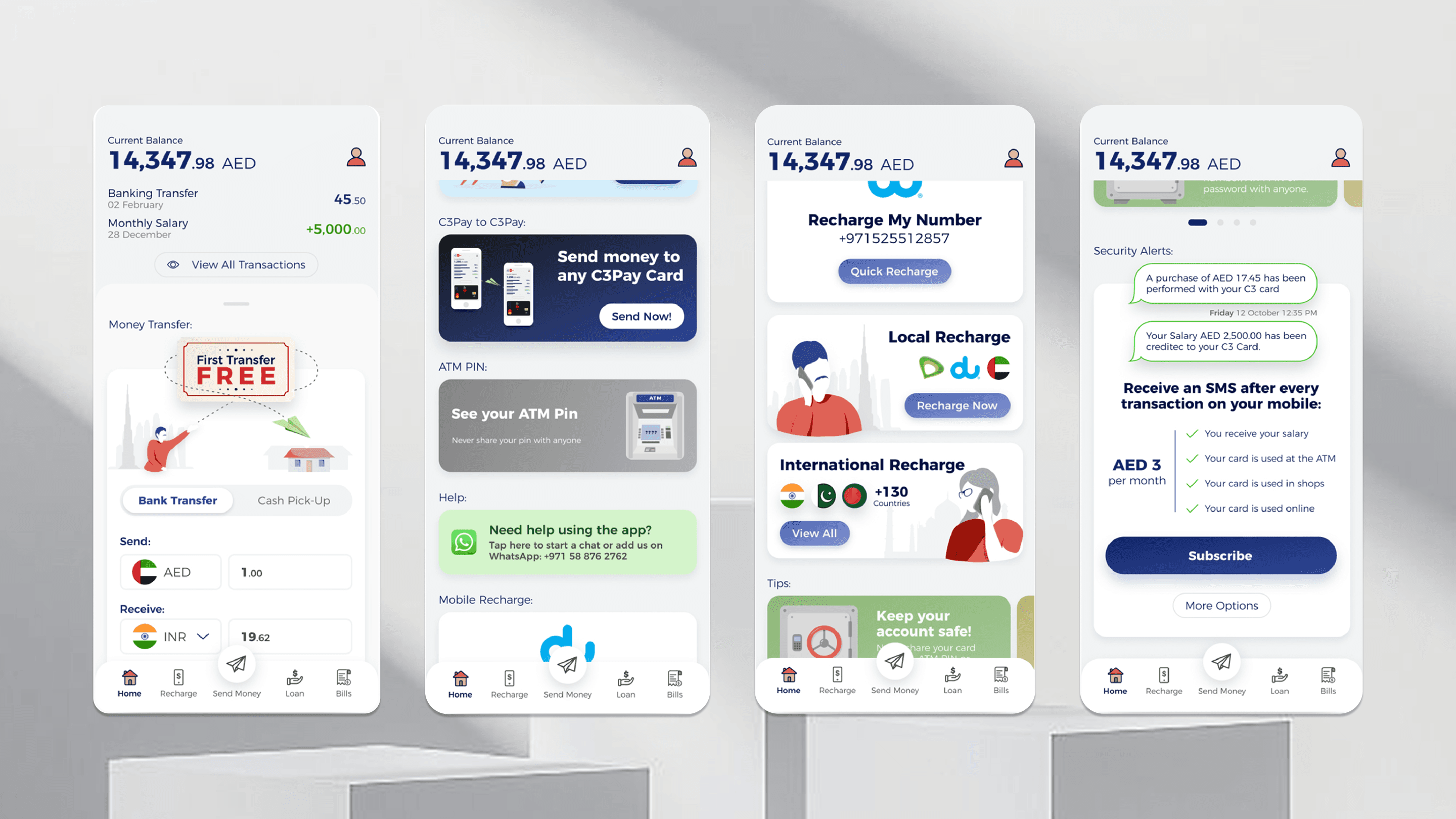
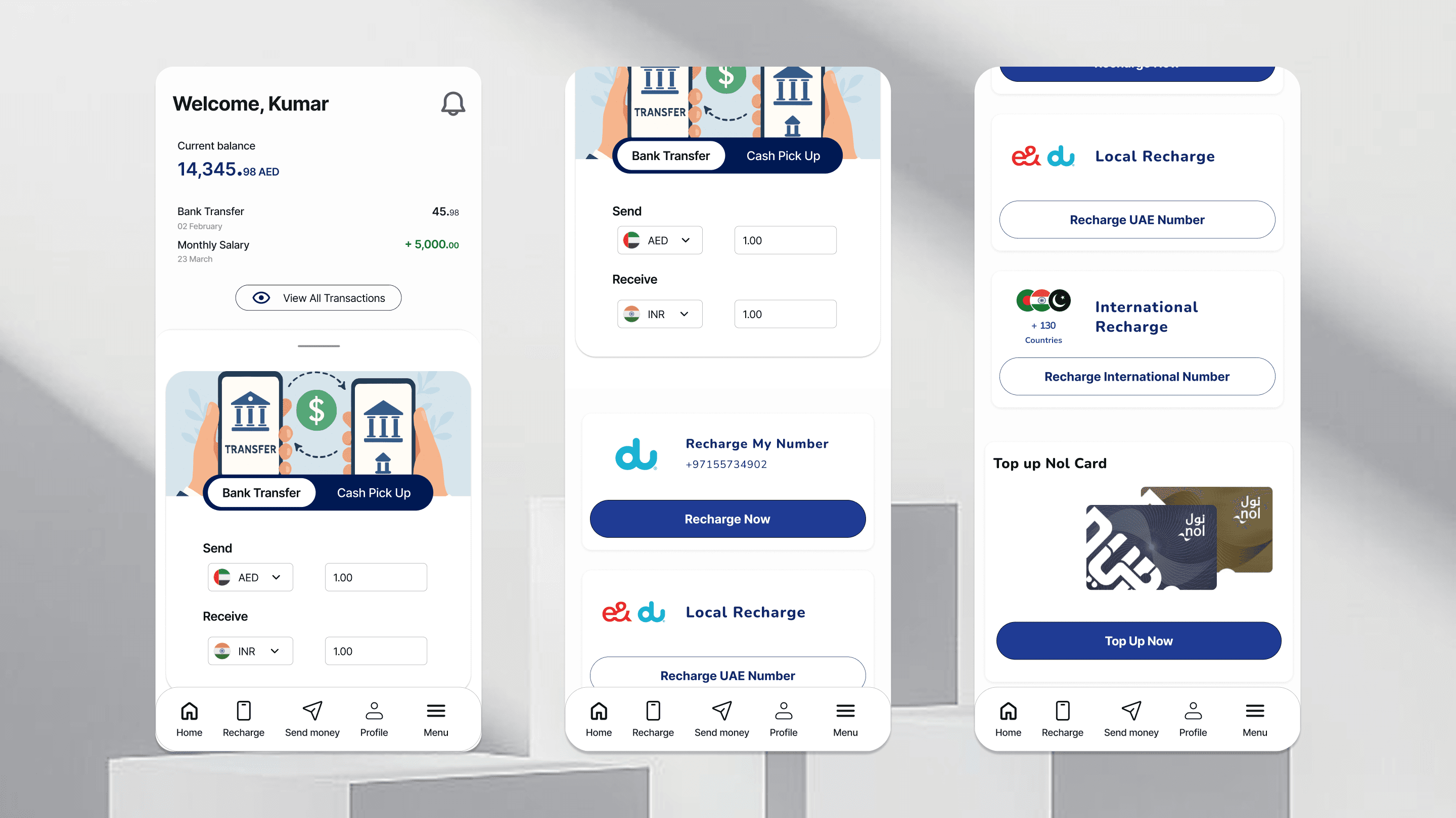
Design Decisions
Bottom Navigation (Old vs New):
Old Navigation: Home, Recharge, Send Money, Loan, Bills
Redesigned Navigation: Home, Recharge, Send Money, Bills, Menu
Rationale: “Loan” was deprioritized due to low relevance to the persona. “Menu” was added to house low-frequency features like Statements, ATM PIN, and Loans.
Dashboard Layout:
Top: Balance summary & recent transactions
Middle: Quick access cards for Money Transfer, Recharge and NOL Top-Up
Bottom: “See more” leading to menu with deprioritized actions
Design Approach:
Focus on fewer, high utility features
Reduce scroll & visual clutter
Use visual cues and icons to aid limited literacy
Visual Design
The updated layout is clean and minimal, placing focus on high frequency actions with easy-to-understand icons and simplified labels. Text is kept minimal and visual hierarchy ensures quick comprehension.
Old Design
Redesign
Key Learnings
Designing for low literacy users requires prioritization, simplification and a deep understanding of daily routines.
HMW framing helps uncover insights and justifies design decisions clearly.
Sometimes, removing features from high traffic areas (like dashboards) is the most effective way to improve usability.
Prioritizing real world context (persona habits, time constraints) leads to a more focused and impactful user experience.

